
by
50%


Only a small percentage of the users of our $2,000/year physics simulation web app for optical designers were converting from free to paid.
I conceptualized and designed the "Reverse Trial" strategy, which raised the free-paid conversion rate by at least 50% and improved the overall user experience for 3DOptix.

Main Concepts
The Reverse Trial is called that way because it turns the old strategy upside down: Instead of starting with a free and basic plan we will start with a free and premium plan:
Give new subscribers a 14 days free Professional plan trial while educating them about the unique and exclusive capabilities of it, which utilizes the well documented psychological principles of feeling of loss aversion and the "lock in" effect.
It is also meant to transform the onboarding process from being purely technical into an exciting user experience.
After the trial period, for users of the Basic plan, display Upgrade Popups after users try to use professional features, thus committing them to active instead of passive memory.

Some of the many Capabilities Carousel slides and Upgrade Popups.
(Illustrative, in reality only one of them is being displayed at a given time)
The 3DOptix Software
A web app for simulating light and optics
Design optical setups in 3D space with digital twins of real optical elements
SaaS that's both B2C and B2B and B2A (A for Academia ;)


3DOptix users
Optical engineers
Physicists
Commercial research labs
Academia: Students, labs, educators

Project Background
Even though 3DOptix had reached a high number of subscribers and active users, most seemed happy enough with using the default limited free version.
There was also a 14 day free premium trial on offer, but it involved paying $2000 upfront for a yearly membership, and not enough of our customers signed up for that.
We needed a better strategy!
A meeting was called and I was tasked with developing a new design and approach.
Research
Every project starts with research:
I analyzed user behavior according to usage and sales data together with the CEO and the PM
I did a heuristic analysis of the existing strategy
Competition research
Learned as much as I could about different freemium/premium sales strategies and the psychology behind them.
The old upgrade strategy

The old strategy was cluttering the 3DOptix workspace with deactivated affordances and little upgrade buttons that were always on display.


We were not selling our unique capabilities, we were hiding them!
After presenting my research to the PM and CEO of the company, they decided that we should implement and test most of my proposed solutions.
Design
The Reverse Trial designs consist of 3 main parts:
The Exclusive Capabilities Info Carousel
a. in the free Professional Plan trial (informational)
b. in the paid Professional plan (informational)
c. in free Basic plan (with upgrade CTA)
d. on our website
Upgrade Popups
Pricing Page
1.
Exclusive Capabilities Info Carousel

Why a Carousel UI?
During the free trial, the carousel opens on the Welcome slide on the first day, and then on a new slide every new day the user logs in.
Each slide is a info popup about the professional capabilities the new customer can explore and use for free during the trial.
Since there are 3 different versions of the same series of popups, I decided to design it as a carousel instead of separate info popups in order to give users access to all the info at all times, and also to make implementation and logistics easier for development and reduce chance for bugs.
1.a.
Carousel
- in 14 days Free Trial of the Professional Plan
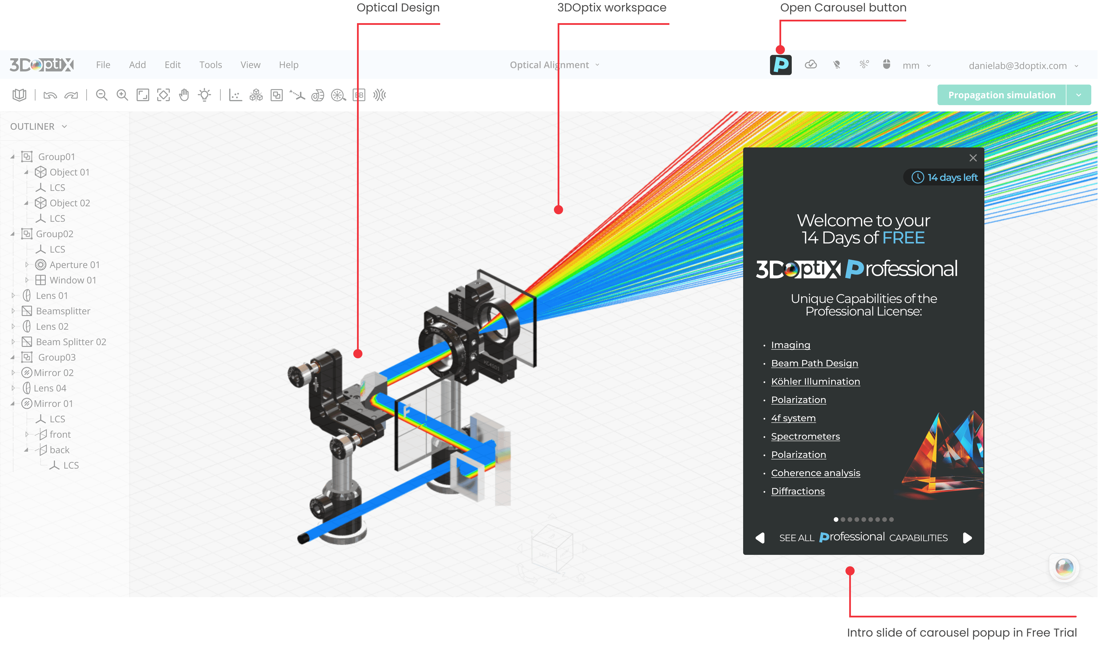


4 out of the 9 slides in the info popup carousel
The implemented carousel during the 14 days of the free Professional Trial
1.b.
Carousel
- in the paid Professional plan


For users that upgraded to the paid Professional plan, the carousel is still available for continuing education and retention. It can be opened from the Help menu.
It has different wording on the intro slide banner and no "Days left" label anymore (of course).
1.c.
Carousel
- in the Basic (free) plan


2 out of the 9 slides in the info popup carousel, this time with upgrade CTA
For users that didn’t upgrade, the carousel is not the main conversion aid anymore. (This will be the Professional Features Upgrade Popups in the next section.)
However, it is still available and can be opened from a very prominent top bar button and from the help menu. It has now a Go Professional! CTA button and no “Days left” display anymore (of course).
The implemented carousel in the basic plan for users that didn’t upgrade after the free trial
1.d.
Carousel
- on the 3DOptix homepage
I figured that the Capabilities Carousel could also a great tool for new user acquisition, and created a version to be implemented on the 3DOptix website.

Screenshot from the 3doptx.com homepage
2.
Professional Features Upgrade Popups


5 out of dozens of Upgrade Popups
Instead of cluttering the interface with upgrade buttons and disabling the professional feature affordances, from now on informational upgrade popups would be displayed when free users try to use professional features and after they click on the (enabled) affordances.
This is at the same time more aesthetically pleasing, more informational and will also, hopefully, turn into active memory which features they are missing out on (in order not to continue triggering the same popups again and again).


From my Figma file: 3 out of dozens of Upgrade Popups
Pricing Page redesign
This page needed to be redesigned to align with the new Reverse trial sales strategy. The existing design felt outdated, and the feature lists for the plans were not up to date.

Visual Design: Revamped the visual aesthetics for a modern and cohesive look.
Plan Renaming: Renamed "Standard" to "Professional."
Plan Removal: Removed the "Advanced" plan.
Feature List Enhancements: Improved the clarity and comprehensiveness of feature lists.
CTA buttons per user status: "Your current plan" buttons
Scroll Animation: Implemented a fixed to top, contracted version of the plans section when scrolling through the features list for better navigation.


What's next? Testing!
"If you can’t measure it, you can’t improve it."
Peter Drucker
If I had more time, for more extensive testing for this tool, I would write usability tests for measuring the metrics in the diagram below and work in tandem with a UX research specialist.


One of the assumptions I made was that users in the free trial should not be bothered by upgrade CTAs and be left alone to explore and appreciate the professional features first. I proposed to test this with an A/B test:
CTA on Carousel during free trial
- Proposed A/B Test
Current implementation:

Current implementation:

Conclusion
I'm really happy about the positive impact this project has had: 50% increased conversions, and a higher awareness about the unique capabilities of the Professional plan.
Thanks for reading! 🎈🙂🚀


